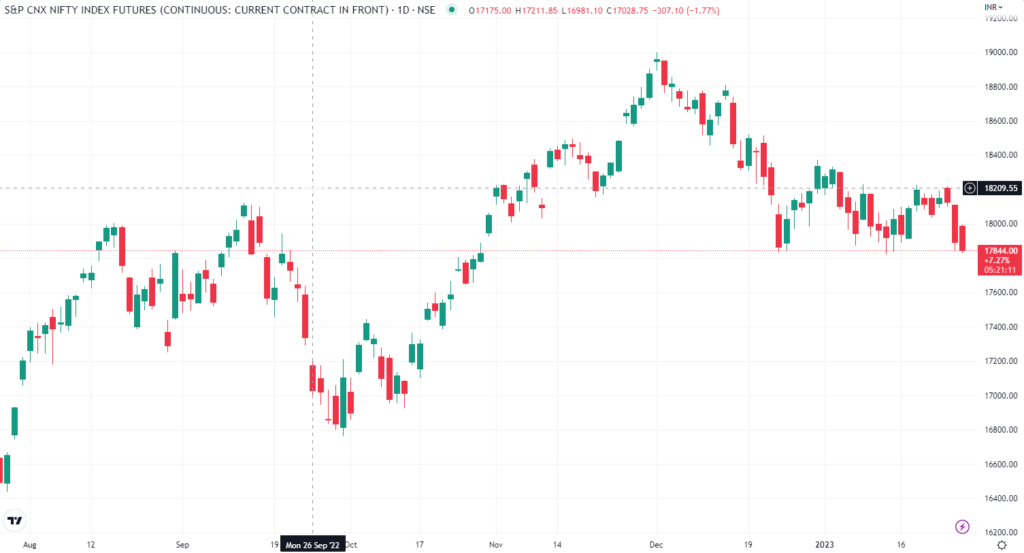
The color of a price candle on a stock chart is used to represent whether the closing price of a security is higher or lower than its opening price. A positive price candle is typically represented in green and a negative price candle is typically represented in red.
The reason for this color convention is rooted in the historical use of paper stock charts. In the past, traders and analysts used to manually plot the daily price movements of stocks on paper charts, marking the opening and closing prices of each day with a vertical line, called a price candle. Traders would use a green pen to mark a candle if the closing price was higher than the opening price, and a red pen if the closing price was lower than the opening price.
This color convention has been carried over to electronic stock charts, where green and red are still used to represent the price direction. Green is used to represent an upward movement in price, or a bullish sentiment, while red is used to represent a downward movement in price, or a bearish sentiment. This makes it easy for traders and investors to quickly identify price movements and trends, allowing them to make informed trading decisions.
The color of a price candle on a stock chart is used to represent whether the closing price of a security is higher or lower than its opening price. A positive price candle is typically represented in green and a negative price candle is typically represented in red. This color convention has its roots in the historical use of paper stock charts, where traders would use a green pen to mark a candle if the closing price was higher than the opening price, and a red pen if the closing price was lower than the opening price. This has been carried over to electronic stock charts making it easy to identify price movements and trends.